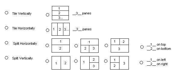
I think the dialog is very simple and very powerful. I unfortunately am
tempted by feature creep! Attached is an alternate appearance for the
top of the window in order to allow for an arbitrary number of panes.
(No making fun of my skills with paint ;)
My thought process is that the user picks one of the 4 options on the
left causing the suboptions to the right to become un-greyed. The user
can then select one of the matching options on the right. Basically,
the first two options are a simple hbox or vbox (and the user can
specify how many panes to put in, default 3). The last two options are
hbox of vboxes and vbox of hboxes. The common features are shown as
pictures to click on but the last is text boxes to specify how many
panes to place into each half.
6 of my 8 pictures are supposed to look just like Ulf's. There are 2
extra pictures for the 2 pane options.
"Olivier Biot" <ethereal@xxxxxxxxxx> wrote:
Great!!! I just can't wait to use it :)

Regards,

Olivier
----- Original Message -----
From: Ulf Lamping
Hi List!

I've used Glade to make a prototype of a page for the preferences
dialog:

[image]

The icons work like radio buttons.

The "Defaults" button will reset the settings to the values as shown.

If a radio button is pressed and the same button for another pane is
already set, the old button will be set to a different value,
so one option (e.g. the "Packet List") will never be selected twice.


More than three panes on the screen might become too complicated to
handle with, at least for this preference page IMO.

We could add other radio buttons later, like "Nothing" or "Endpoint
List", but I would like to implement it the way described above to get
an idea if its working ok.

As we have lot's of space in the page and only a few options, I would
prefer radio buttons as they are better understandable. If we later
get a lot more options, we might want to use three drop-down lists.

Regards, ULFL


